
Pie Chart to Dashboard
Pie charts are a popular way of visualizing data, particularly when it comes to displaying proportions or percentages of a whole. They offer a quick and easy way to grasp a broad picture of how different parts of something relate to each other, making them an invaluable tool for anyone looking to convey information in a clear and concise way.
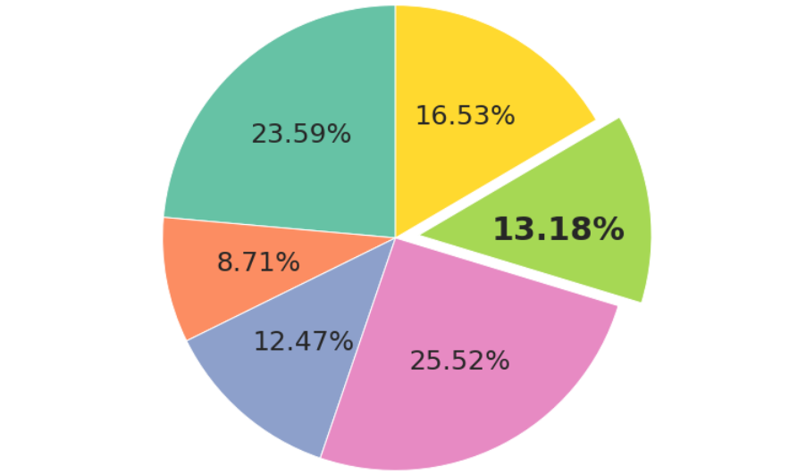
Pie charts work by dividing a circle into sections, with each section representing a different value. The size of each section is proportional to the value it represents, meaning that larger sections correspond to larger values, while smaller sections correspond to smaller values.
The effectiveness of a pie chart depends on several factors, including the accuracy of the data being represented, the clarity of the labels and legend, and the visual design of the chart itself. When used correctly, pie charts can be an incredibly useful way of conveying complex information in a simple and intuitive way.
One of the key benefits of using a pie chart is that it makes it easy to compare the relative sizes of different parts of a whole. For example, if you were trying to convey the distribution of sales across different product categories, a pie chart would allow you to quickly see which categories are performing well and which are not.
Pie charts are also useful for highlighting differences between different data sets. For example, if you were comparing the results of two different surveys, a pie chart could quickly show you which survey had more respondents and which had fewer.
Another advantage of pie charts is that they are visually appealing, making them more engaging and memorable than other types of charts or graphs. The use of color and other design elements can help to draw attention to key points or to make certain sections stand out more than others.
Despite their many benefits, pie charts are not always the best option for visualizing data. In some cases, they can be misleading or difficult to interpret, particularly when there are many sections or when the values being represented are similar in size. In these situations, other types of charts, such as bar graphs or line graphs, may be more effective.
Overall, pie charts are a powerful tool for anyone looking to convey information in a clear and visually appealing way. With the right data and design elements, they can be an incredibly effective way of communicating complex information in a way that is easy to understand and remember.