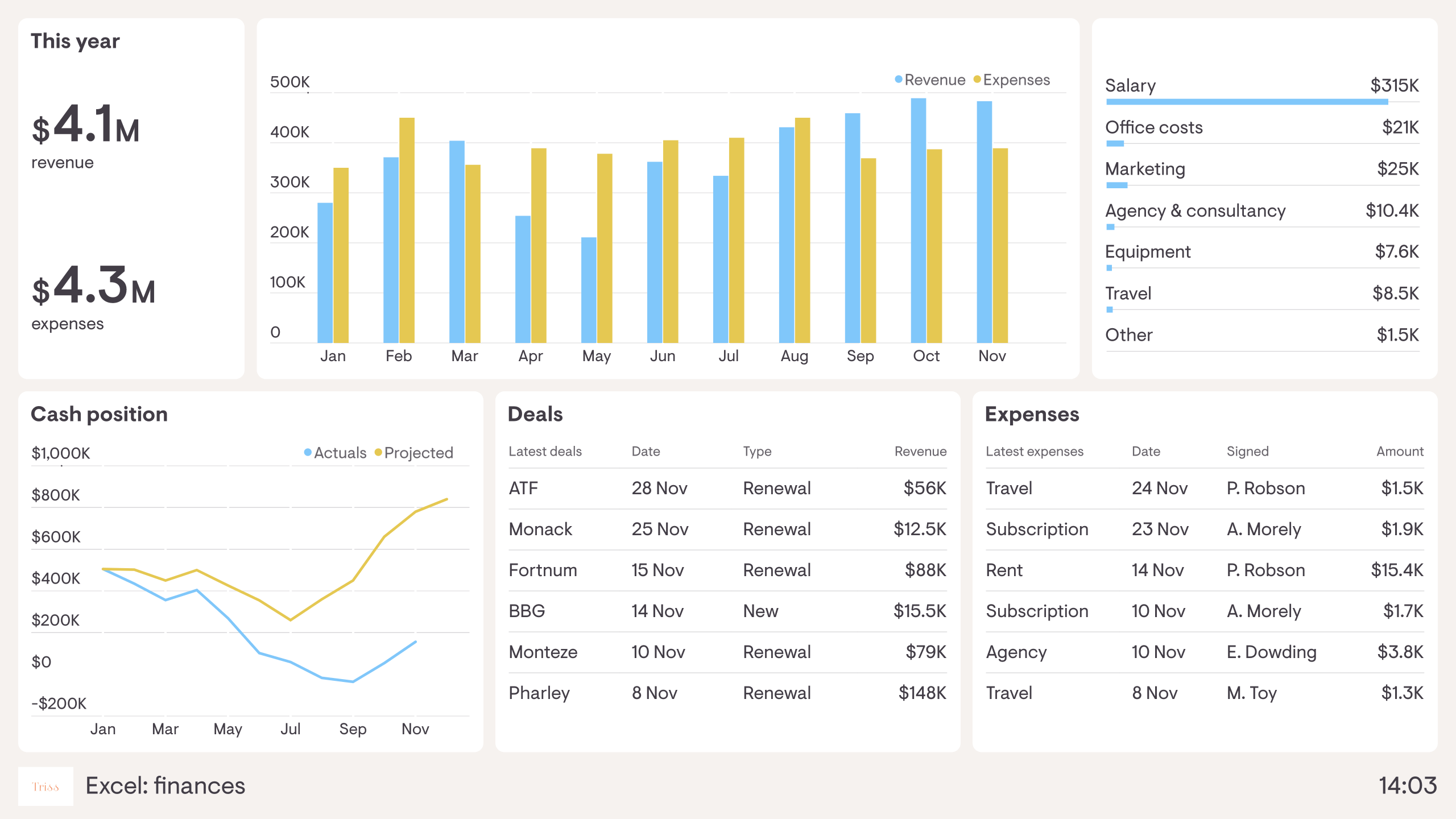
Excel to Dashboard

If you've ever worked with data in Excel, you know that creating visualizations can be time-consuming and tedious. However, with the rise of dashboard tools, such as Tableau, Power BI, or Google Data Studio, creating data visualizations has never been easier. In this post, we will explore how you can transform your Excel data into stunning dashboards with just a few clicks.
Step 1: Clean and organize your data
Before you start creating your dashboard, you need to make sure that your data is clean and organized. This means removing duplicates, correcting errors, and formatting your data consistently. You should also organize your data into tables or ranges, with each table representing a different aspect of your data, such as sales, customers, or products.
Step 2: Connect your data to your dashboard tool
Once your data is clean and organized, it's time to connect it to your dashboard tool. Most dashboard tools allow you to connect to a variety of data sources, including Excel files. Simply choose the Excel file containing your data and select the tables or ranges you want to use.
Step 3: Create your visualizations
Now comes the fun part: creating your visualizations. Most dashboard tools offer a wide range of chart and graph types, such as bar charts, line charts, pie charts, and scatter plots. Simply select the type of chart you want to create and choose the data you want to use.
You can also customize your visualizations by adding colors, labels, titles, and other design elements. Most dashboard tools offer a drag-and-drop interface, which makes it easy to move and resize your visualizations.
Step 4: Build your dashboard
Once you have created your visualizations, it's time to build your dashboard. This is where you bring all your visualizations together into a single, interactive interface. Most dashboard tools offer a variety of layout options, such as grids, tabs, or freeform layouts.
You can also add other elements to your dashboard, such as text boxes, images, or buttons. This allows you to provide context and interactivity to your data, making it easier for your audience to understand and explore.
Step 5: Share your dashboard
Finally, it's time to share your dashboard with your audience. Most dashboard tools allow you to publish your dashboard online, either as a link or an embed code. You can also set up permissions and access controls so that only authorized users can view or edit your dashboard.
In conclusion, creating data visualizations has never been easier, thanks to dashboard tools. By following these simple steps, you can transform your Excel data into stunning dashboards that are both informative and engaging. So why not try it out for yourself and see how easy it can be to create a data visualization dashboard?
