
Cards to Dashboard
In the world of data visualization, dashboards are a powerful tool for presenting complex data in a visually compelling and intuitive way. However, designing an effective dashboard can be a challenging task. One technique that can make it easier is using cards to build your dashboard.
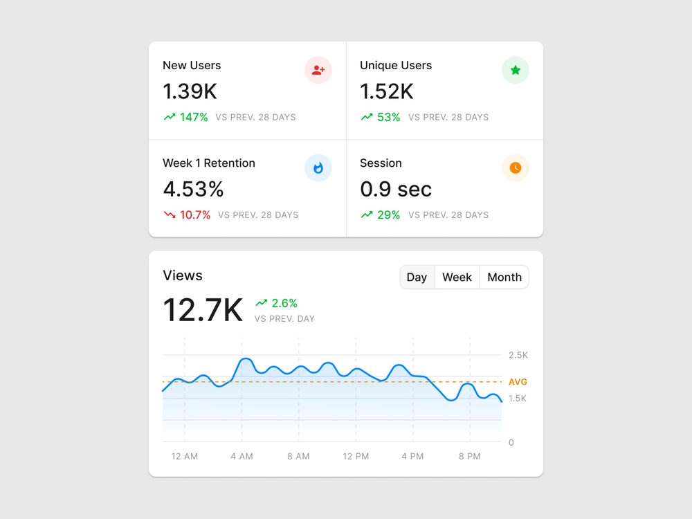
Cards are small, self-contained units of content that can be used to display a wide variety of data. They can contain charts, tables, text, images, or any other type of content that you want to display on your dashboard. In this blog post, we will explore how to use cards to build an effective dashboard.
Determine the Purpose of Your Dashboard The first step in building an effective dashboard is to determine its purpose. What questions are you trying to answer with your dashboard? What information do you want to convey to your audience? Once you have a clear understanding of the purpose of your dashboard, you can start to think about the types of cards you want to include.Choose Your Cards The next step is to choose the cards that you want to include on your dashboard. You can choose from a wide range of card types, including:
Charts: Line charts, bar charts, pie charts, and other types of charts can be used to display trends, comparisons, and distributions. Tables: Tables can be used to display detailed data, including numeric values, dates, and text. Text: Text cards can be used to provide context, explanations, and other types of written content. Images: Images can be used to add visual interest and to provide context to the data. Design Your Cards Once you have chosen the cards that you want to include on your dashboard, you can start to design them. Each card should be visually appealing and easy to read. Consider using a consistent color scheme and typography across all of your cards to create a cohesive look.
Organize Your Cards The final step is to organize your cards on your dashboard. You can arrange them in a grid or use a more free-form layout. Consider the order in which you want your audience to view the cards. You may want to start with an overview of the data and then move on to more detailed cards.
Conclusion
Using cards to build your dashboard is an effective way to present complex data in a visually compelling and intuitive way. By following these steps, you can create a dashboard that effectively conveys your message and provides insights into your data. With practice, you can refine your approach and create even more powerful and effective dashboards.